2025
Krafttrans
Entrant
Alisa Gannota
Category
Design and Creativity - Corporate Identity
Client's Name
Krafttrans
Country / Region
United States
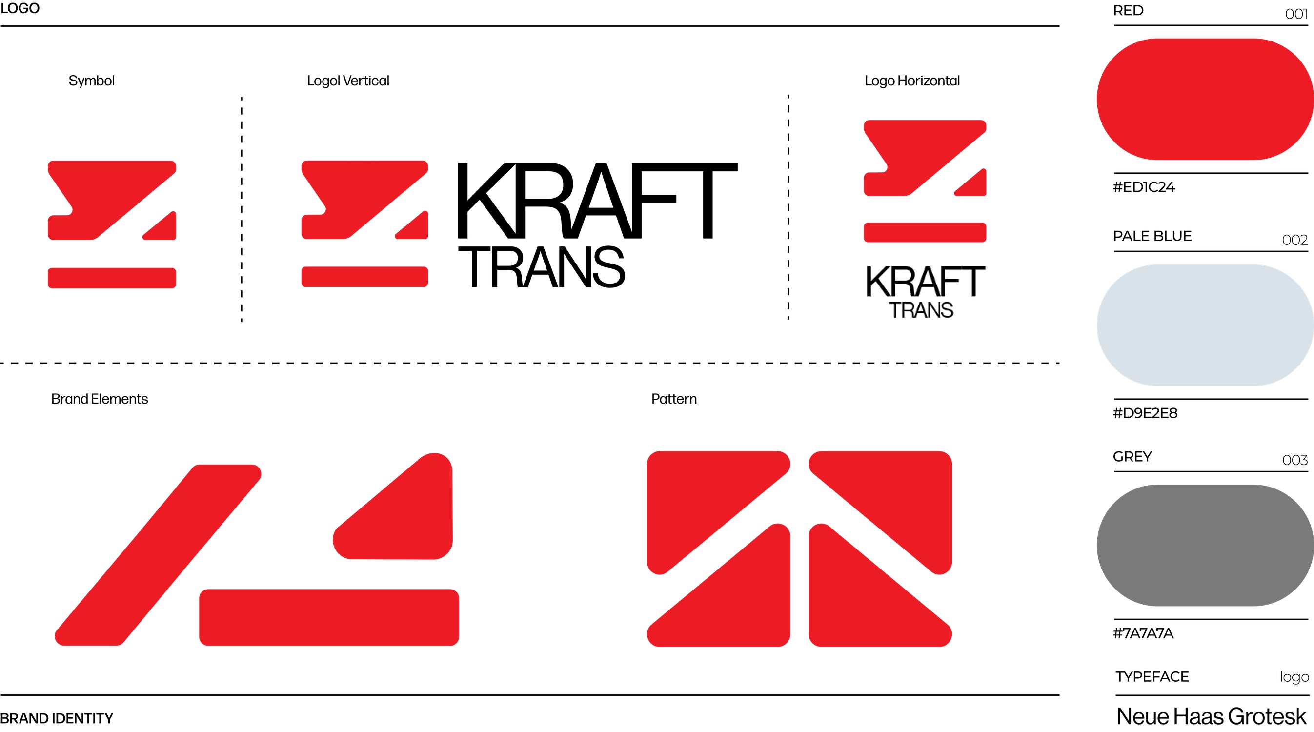
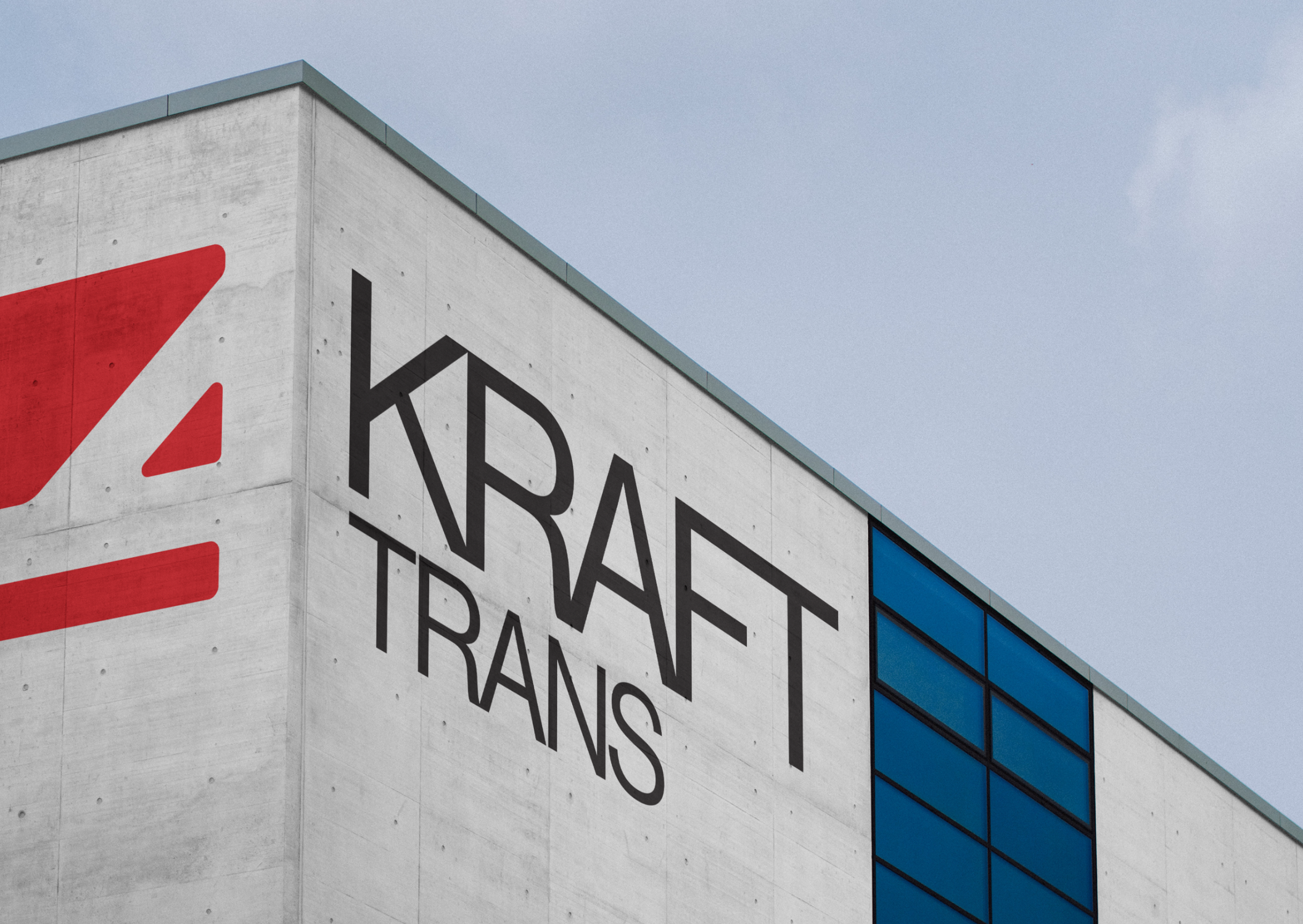
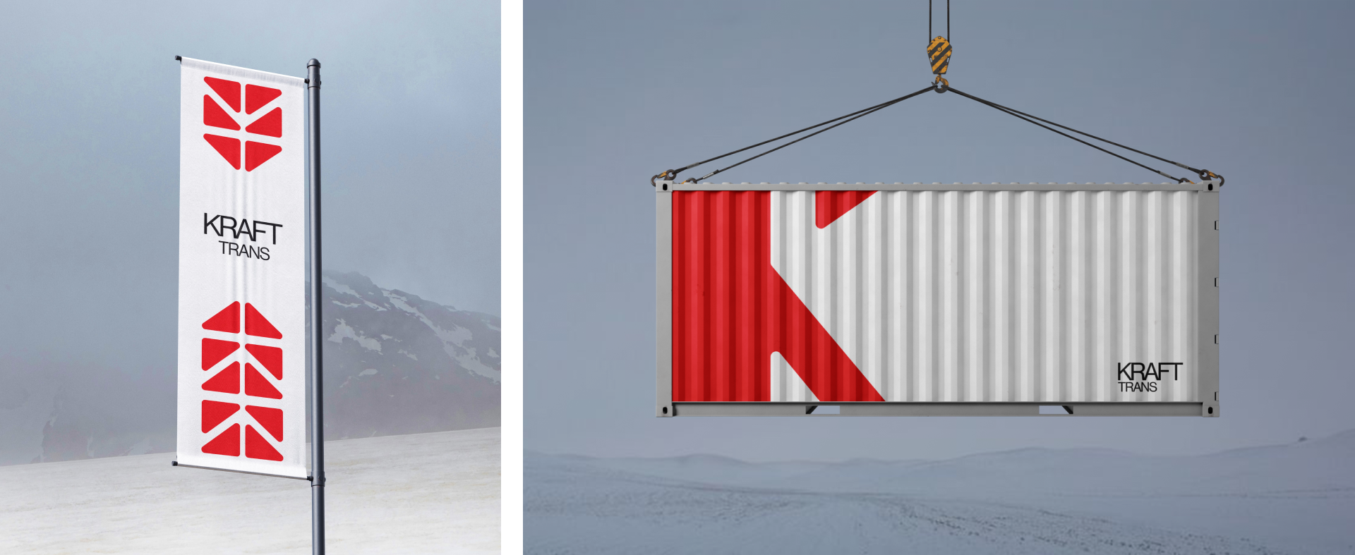
The new KRAFTTRANS identity modernizes the brand while preserving its legacy. By retaining the original typeface and color scheme, the redesign ensures continuity and recognition. A refined letter “K,” created through negative space, forms the core of the new logo, symbolizing movement, precision, and adaptability—key qualities in the logistics industry.
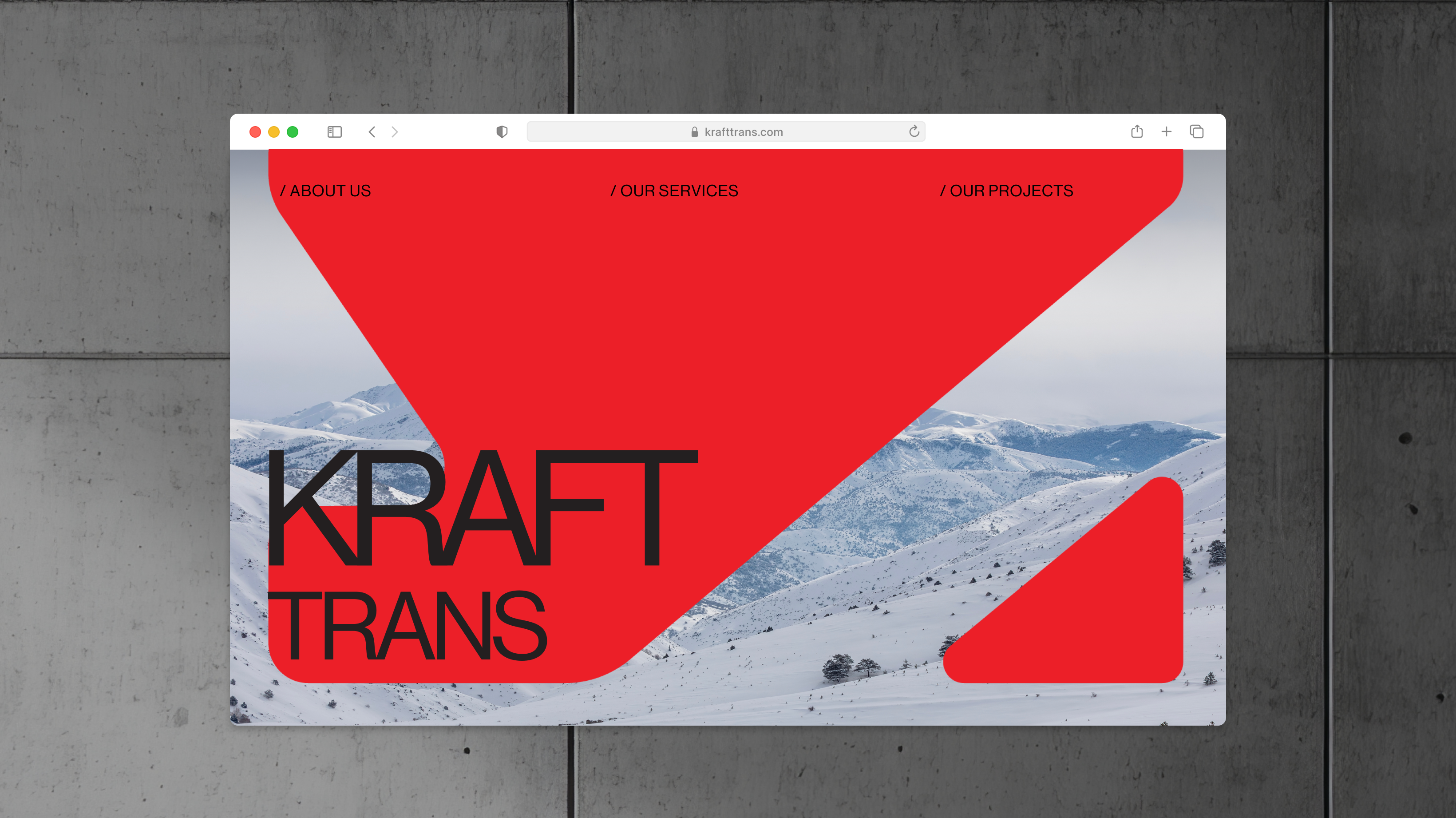
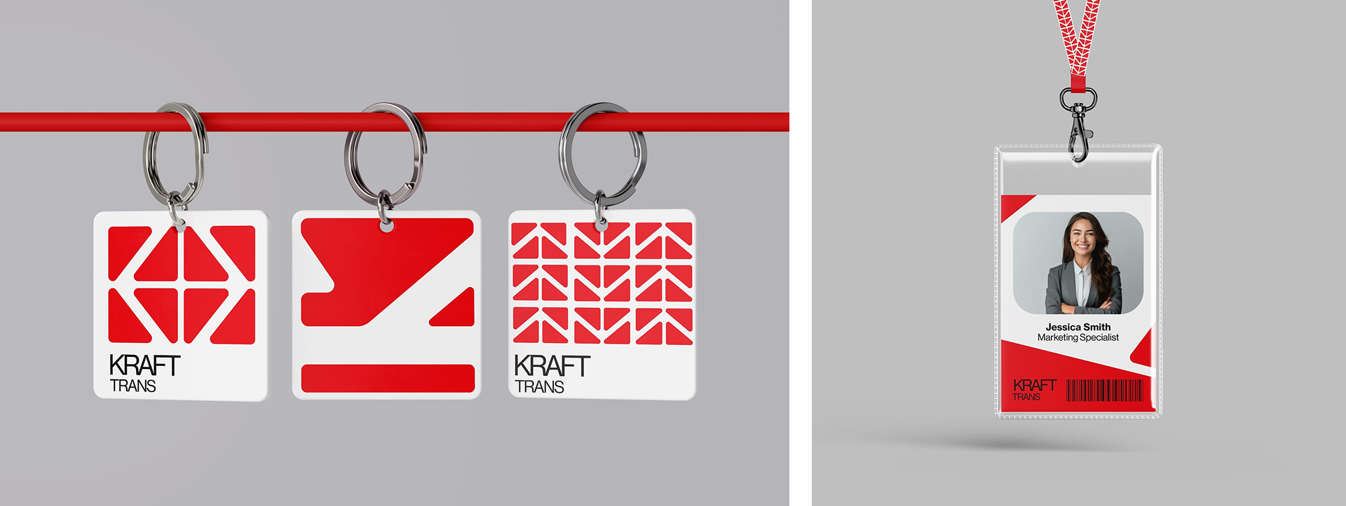
Beyond the logo, the visual system introduces a modular approach, allowing the “K” to be used dynamically across various applications. These elements can form patterns, structures, and branded assets, ensuring consistency while offering flexibility for different touchpoints, from print to digital and vehicle branding. This adaptable system strengthens KRAFTTRANS’ visual presence and reinforces its seamless, global operations.
The result is a clean, modern identity that balances heritage with innovation, visually communicating KRAFTTRANS’ commitment to efficiency, reliability, and progress in the freight forwarding industry.

Credits

Entrant
Kiran Purushotham
Category
Apps & Softwares - Best Use of AI & Machine Learning
Country / Region
United States

Entrant
Ashish Mohan
Category
Strategy & Marketing - Marketing Effectiveness
Country / Region
United States

Entrant
Satya Subrahmanya Sai Ram Gopal Peri
Category
Apps & Softwares - Best Use of AI & Machine Learning
Country / Region
United States

Entrant
Yadagiri Nadiminty
Category
Apps & Softwares - Best Technical Achievement
Country / Region
United States